Creating a targeted experience for Immunology research
Using robust visualization tools that promote research and collaboration, the Allen Institute's Immunology team is unlocking the mysteries of the human immune system to make a significant improvement in patients’ health and wellbeing.
To comply with my non-disclosure agreement, I have omitted and / or concealed confidential information in this case study. All information in this case study is my own and does not necessarily reflect the views of the Allen Institute.
Project Summary
The Immunology team at the Allen Institute needed a seasoned UX consultant to envision a scientific research ecosystem to manage and analyze large volumes of data and encourage scientific collaboration on studies. Their flagship product, the "Human Immune System Explorer" (HISE) needed a complete evaluation and overhaul to bring elegance and simplicity to the end-user experience and formulate a powerful product offering.
Deliverable
Starting with a complete evaluation of product capabilities and user objectives, my goal was to use UX principles and best practices to uncover opportunities and facilitate the design of a targeted user experience for HISE - a new to market scientific research platform.
My Role
Although the Allen Institute is a long-standing non-profit organization, their Immunology group was new to the stage. Seeing the job posting for an intense 6-month contract, I could not help but think there was not a better time than the height of a pandemic to build an immunology product that would literally contribute to saving lives!
The product - HISE (Human Immune System Explorer) was conceived to aid Immunologists in uncovering solutions for disease prevention and treatment. My role? Figuring out how to establish a user experience that would align with scientific research trends and provide meaningful insights to scientists in the broader scientific community.
Through the hard work of the Software Team and the Immunology Research Team, the product was already setup to sift through millions of data points and provide the Allen Institute for Immunology and its academic partners with layered access to analyzed results using managed computer environments running Jupyter notebooks. For scientific researchers (the users) this required some level of technical knowledge, including scripting, and could continue to be useful for the institute's more tech savvy users. However, it did not make the product accessible to the broader user base.
In its next evolution, the Institute sought to greatly broaden their audience to include the larger scientific community and the public. For this, a solid a web-based product was needed, with focus on ease of use and accessibility.
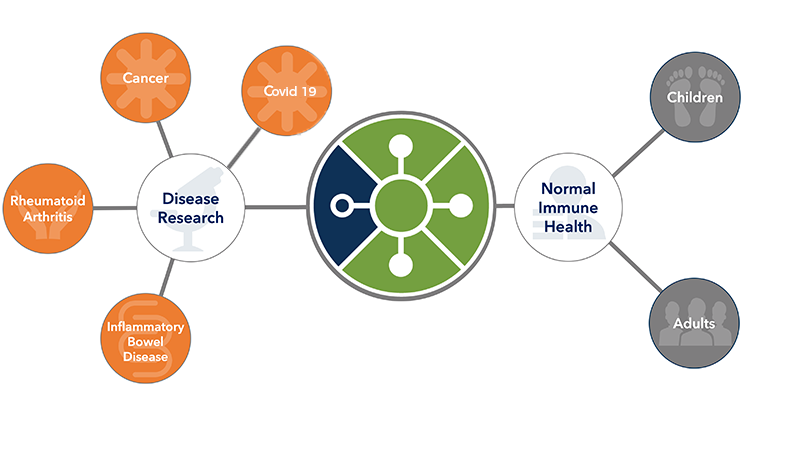
WHY does this product matter?
“Understanding the human immune system in detail and figuring out what goes wrong in disease is an incredibly complex but solvable problem” said Allan Jones, Ph.D., President and CEO of the Allen Institute.
HOW does the product address the why?
“By unraveling the mysteries of the dynamic immune system in healthy individuals and focusing the same cutting-edge tools on patients in various disease states, we believe we will find new ways to diagnose and ultimately treat disease… We are looking at problems that have large unmet needs. Patients are not only suffering from these immune-based illnesses, patients are dying from some of these disorders, and we would like to change that.” said Thomas F. Bumol, Ph.D., and Executive Director of AIFI.
Product and User Understanding
Establishing a UX Roadmap
Approach
To design the right user experience, I needed to first understand how immunologists would use this technology and data to unravel clues about the immune system. For this, I worked with the team to identify the top 3 product goals where UX practices could have the largest impact.
1- Understand and document the user's workflow and job function
2- Optimize and simplify the user’s track to meaningful scientific results
3- Create simple and intuitive ways to collaborate with peers
Planning
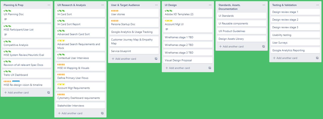
Once product goals were established I created a Trello board to capture the steps and milestones ahead. As this board evolved, it served as a reference and indicator of ongoing progress.
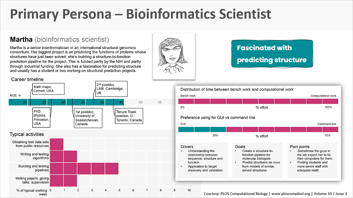
Primary User Personas
Two primary user personas were identified that effectively represented the more tech savvy scientist that the product initially addressed, and those research scientists representing the broader scientific community being targeted.
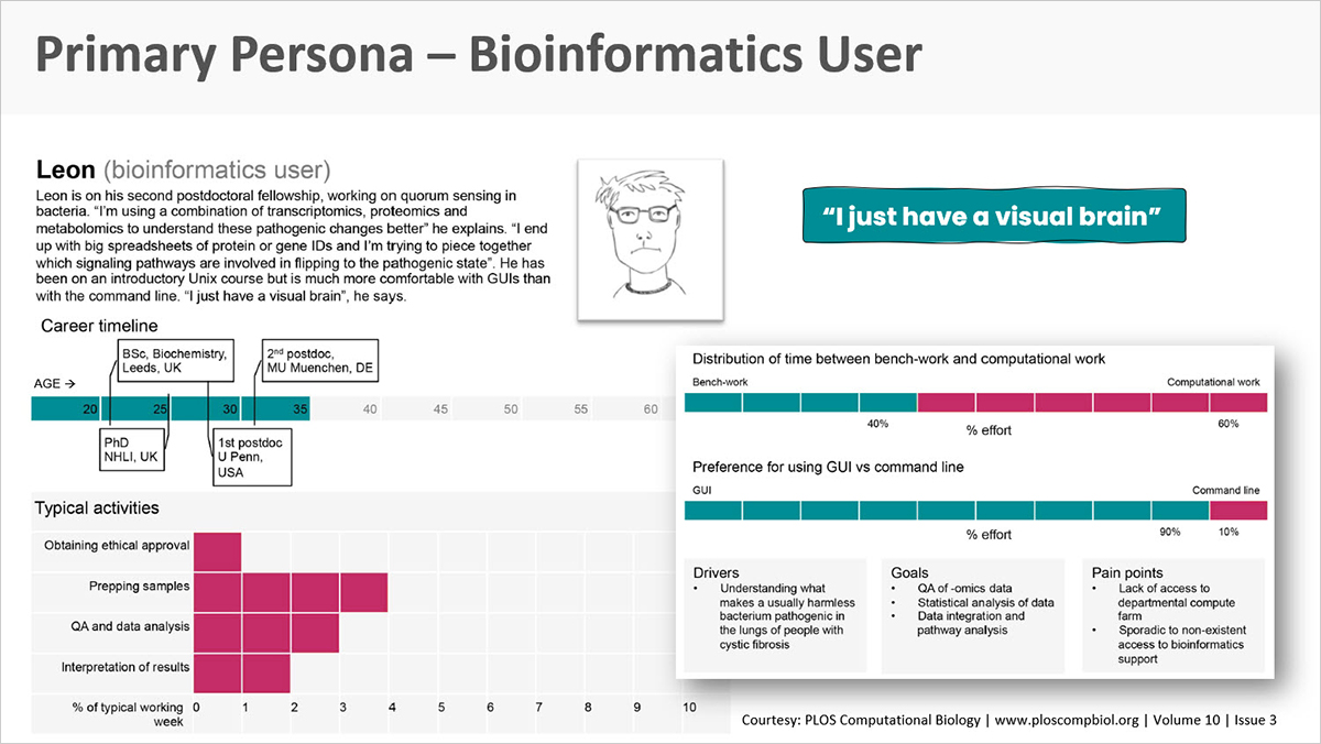
The Allen Institute has the benefit of teams with great cross-functional communication. Better yet, they have an internal team of representative users who could easily assist in persona development and validation - this dramatically expedited persona development.
Documenting Challenges
Data organization / findability
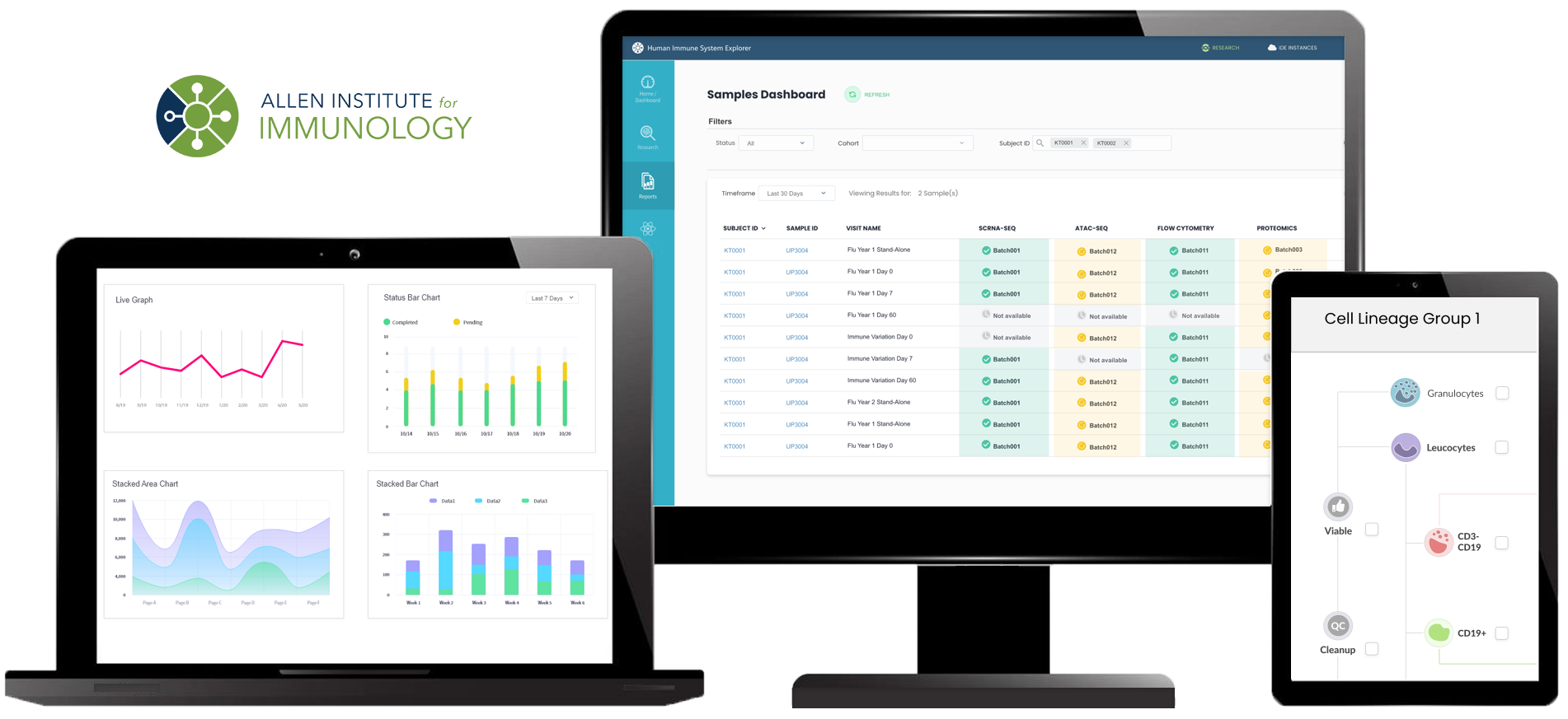
To get to meaningful results, the product would need a solid information architecture that would allow researchers to navigate from data files to meaningful results.
Robust search features
The current working product only included basic search features. As such, users would need to page through multiple list pages to find data samples relevant to their research. They were spending valuable time sifting through data files line by line. Additionally, the product’s existing architecture would need to be heavily upgraded to support some much needed advanced search features that were in high demand.
Research approach
STUDY 1 - Card sorting and survey
Card sorting was selected to address the need to identify usability improvements particularly as they related to information architecture and the goal of designing a more robust search feature.
For both the card sort and subsequent user interviews, we engaged 15 total participants: 9 in the Analyst or Power User role, and 6 in the research scientist role. Seven of these participants had never used HISE and 8 used the product for under 6 months. Participants included Experimental Immunologists, Molecular Biologists, and Computational Biologists.
What is a card sort in UX?
“Card sorting is a method used for determining information architecture labels and structures to be used in a web-based product and gives insights to better understand users’ mental models. Card sorting also helps designers, developers and stakeholders understand which changes need to be made to the structure based on user insights, rather than relying on internal opinion.” -Usability.gov
Prior to each card sort exercise, users completed a questionnaire with survey questions. This gave us the opportunity to identify the top 3 items on their wish list for HISE.
Top 3 items for Analysts/Power Users
- .More interactive file data retrieval.
- Easier results sharing of interactive data and visualizations
- Ability to download only filtered sample observations, rather than downloading everything.
Top 3 items for Scientists
- Ease of finding and sorting data to search using various parameters and gather cohorts of patients to compare.
- Ability to look at and compare data from several patients with quick visualizations.
- Variety of stats and visualization tools to explore the data.
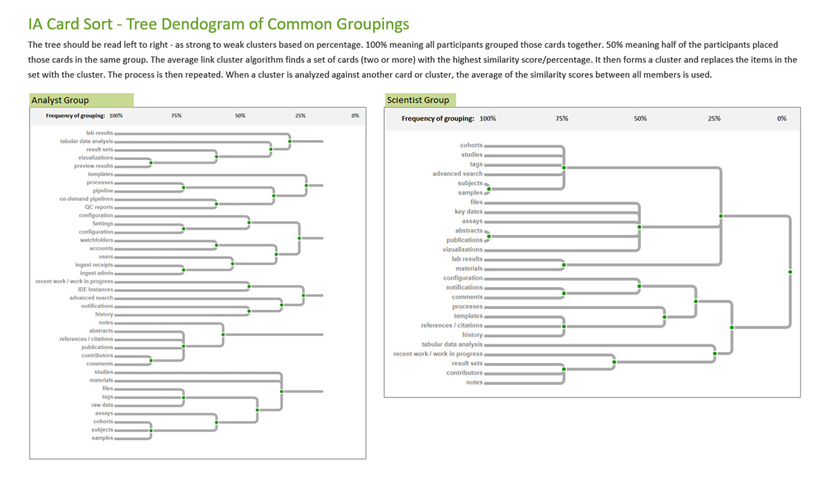
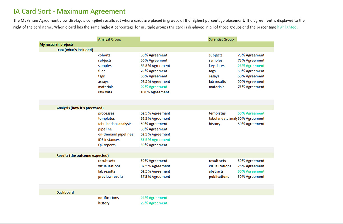
Card sort results
The results of the card sorting study come in the form of a frequency matrixes that effectively answered the following questions:
A) Which items do users expect to appear together most often?
B) How many and which categories make sense to the majority of users?
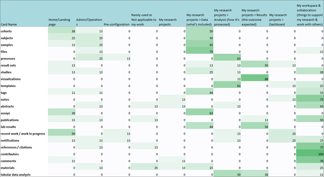
As showcased below, card sorting helped us understand the user's mental model as it pertained to information grouping and allowed me to produce a variety of diagrams to help visualize findings and inform the site's information architecture to match those mental models.
STUDY 2 - User and stakeholder interviews
A user interview is a UX research method during which a researcher asks one user questions about a topic of interest (e.g., use of a system, behaviors, and habits) with the goal of gaining an in-depth understanding of the users' values, perceptions, and experiences.
Topics for my interview sessions included descriptions of job function and technologies used, in addition to collaboration methods throughout the research and publishing phases. For those users who had experience with the existing baseline product, a HISE walk-through was included.
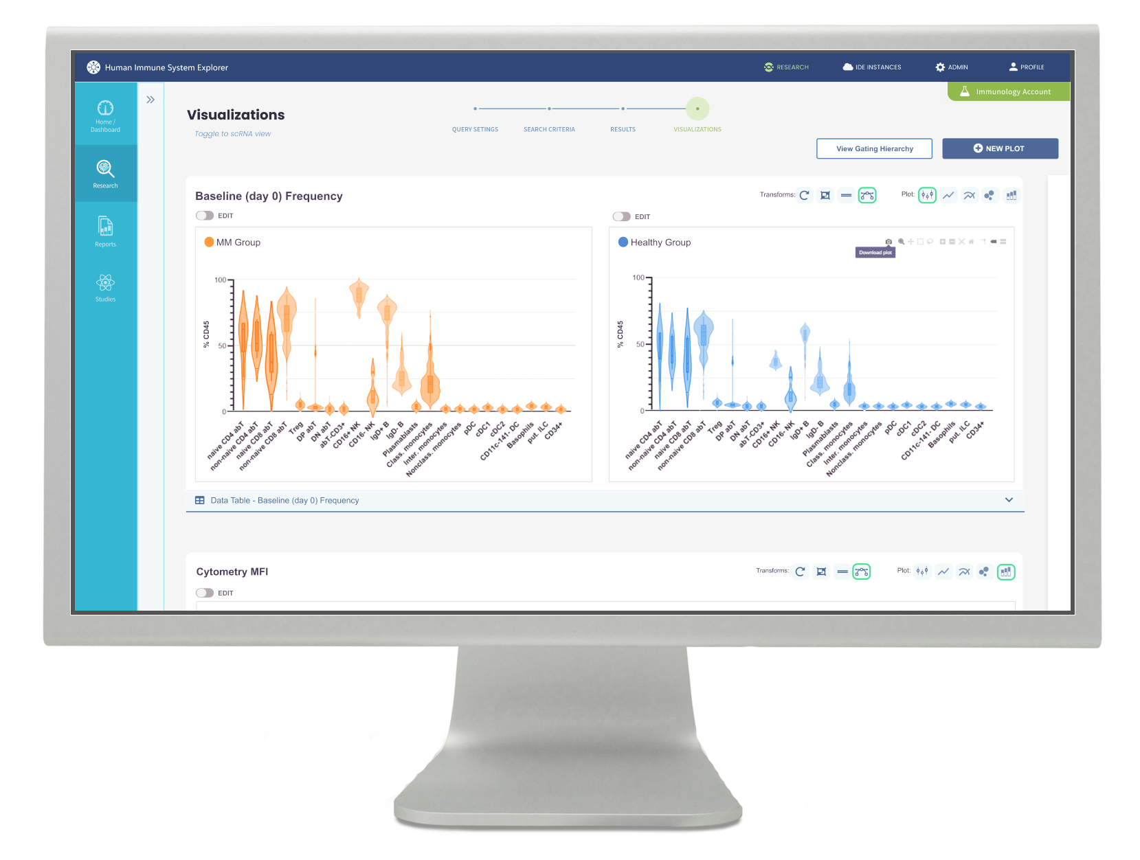
Key Finding - Interactive visualization was crucial
Immunology research includes data derived from flow cytometry lab analysis. A critical part of the evaluation process is being able to subset and re-subset data on-demand using interactive graphing to produce cytometry visualizations.
“Static visuals only get you so far, especially with complex data” said one user.
The recommendation was to consider what level of minimally viable interactivity could be built into HISE to accommodate Flow Cytometry analysis without the dependency of 3rd party tools. The image below shows the resulting design proposal.
Key Finding - Data organization and findability was lacking
Data should be more organized and accessible according to multiple HISE users...
“The stumbling block right now is that data organization and access is just not usable”
“I would classify myself as a power user and I can’t even find a simple graph. I don’t even want a specific file, just any random flow graph!”
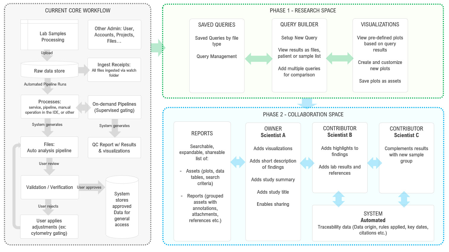
To fully resolve this issue would require reorganization of the product’s information hierarchy, which was a longer-term project, but there were some more immediate upgrades that could significantly improve data findability and serve as interim solutions. Working closely with the Engineering team and Project Manager, a phased approach was outlined.
The following workflow diagrams assisted in envisioning the phased outcome.
Aligning insights with design
Adobe XD Prototypes
Adobe XD was selected as our prototyping tool because it allowed me to easily evolve from low to high fidelity designs. During this stage we maintained bi-weekly design reviews and user review sessions twice per month.
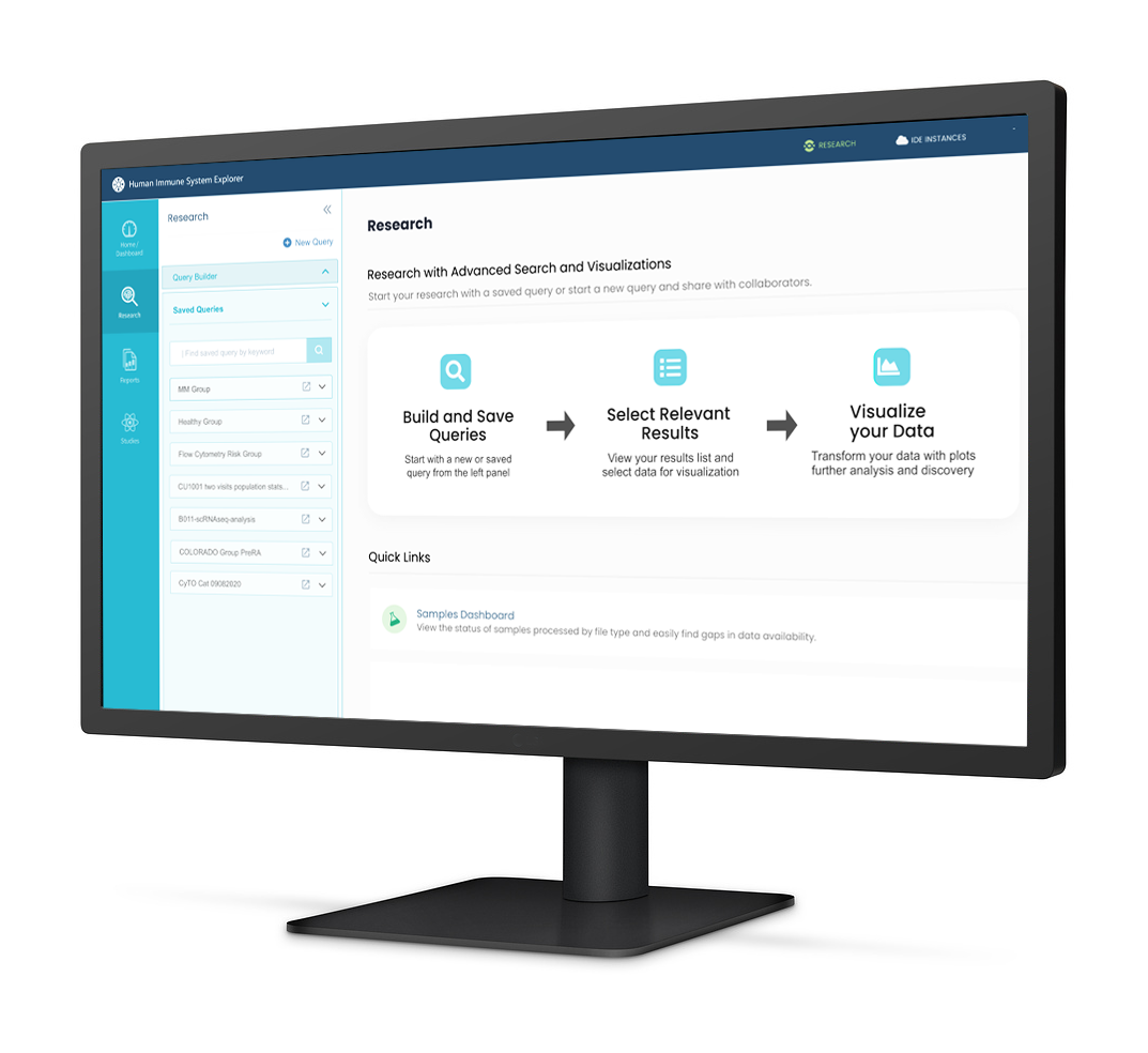
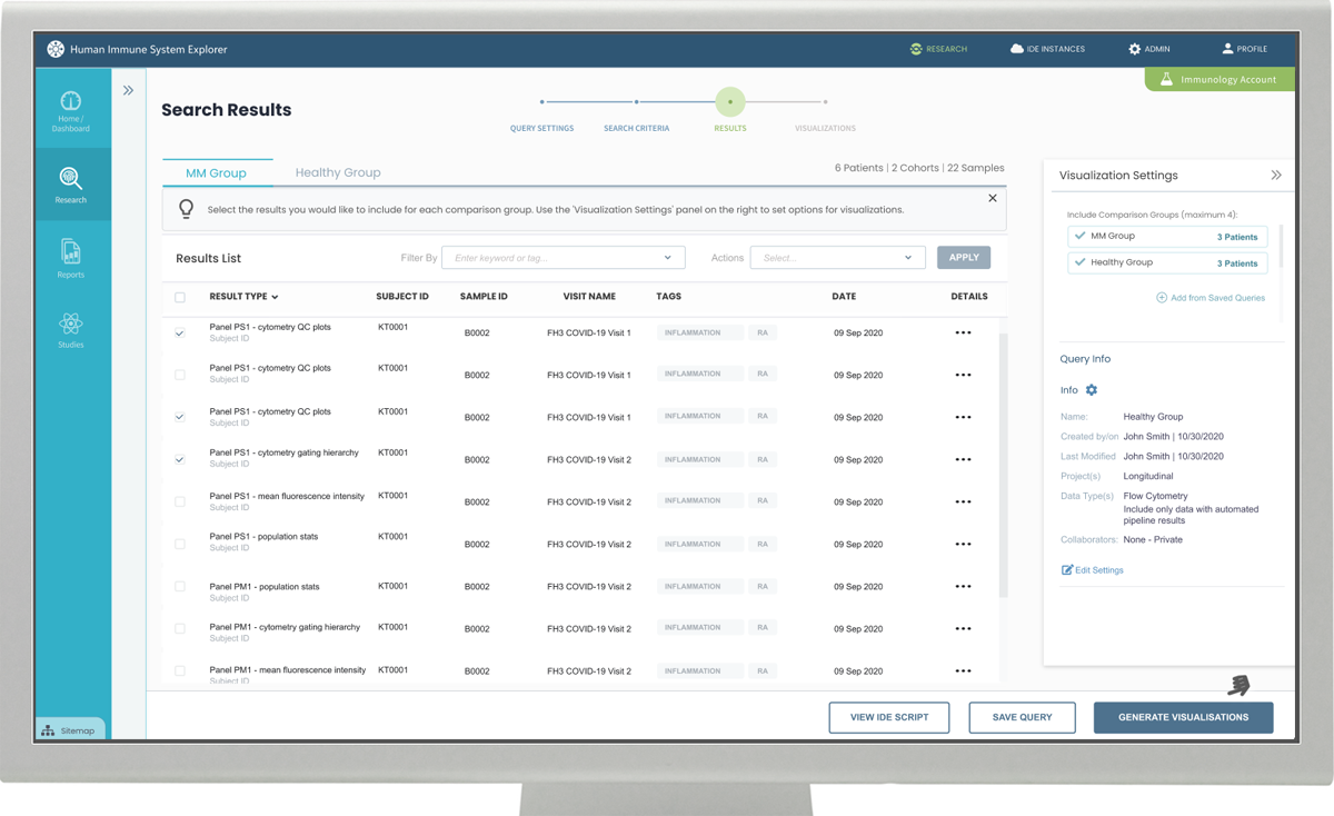
Making it easy to find relevant data
We learned that first and foremost, users wanted easy access to relevant data so they could assemble meaningful results.
The studies revealed common patterns in a researcher's approach. For example, the way in which data was derived or 'data type' was a common first consideration, as this represents lab work conducted using differing methods (scRNA sequencing vs, Flow Cytometry vs, ATAC-sequencing vs, Clinical Metadata, etc.) Additionally, patient (subject) demographics and patient samples would narrow down the target data set by disease cohort, gender, age, and disease status. Common to the search process was the additional complexity of creating comparison groups. For example, comparing disease patients to healthy patients to identify those variations that contribute to disease outcomes.
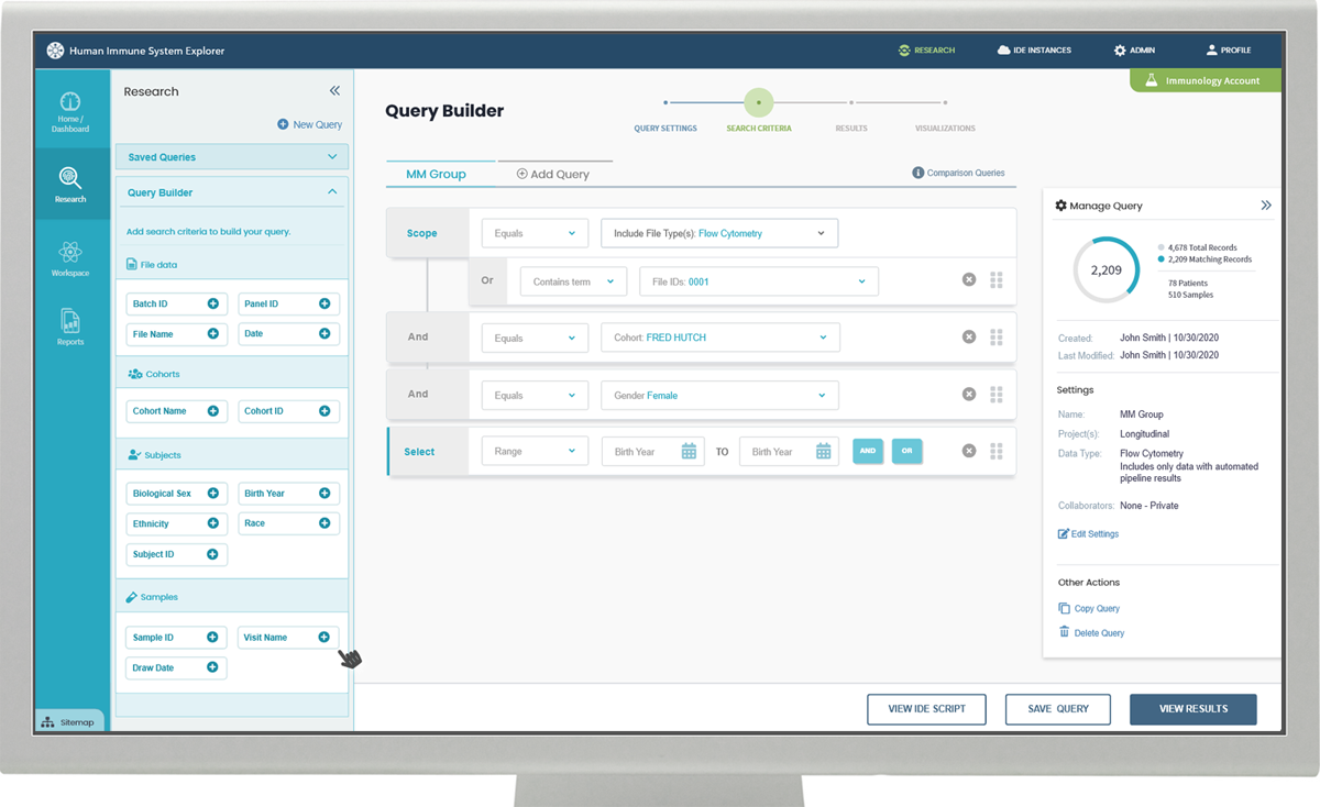
The search interface needed to provide these features, while remaining flexible enough to accommodate a wide variety of research scenarios. Also, given that researchers spent extensive time assembling search criteria and working closely with peers, designs were optimized to allow naming, saving, and sharing of searches – making it easy to re-run and retrieve results against new or updated datasets.
Visualization of Results
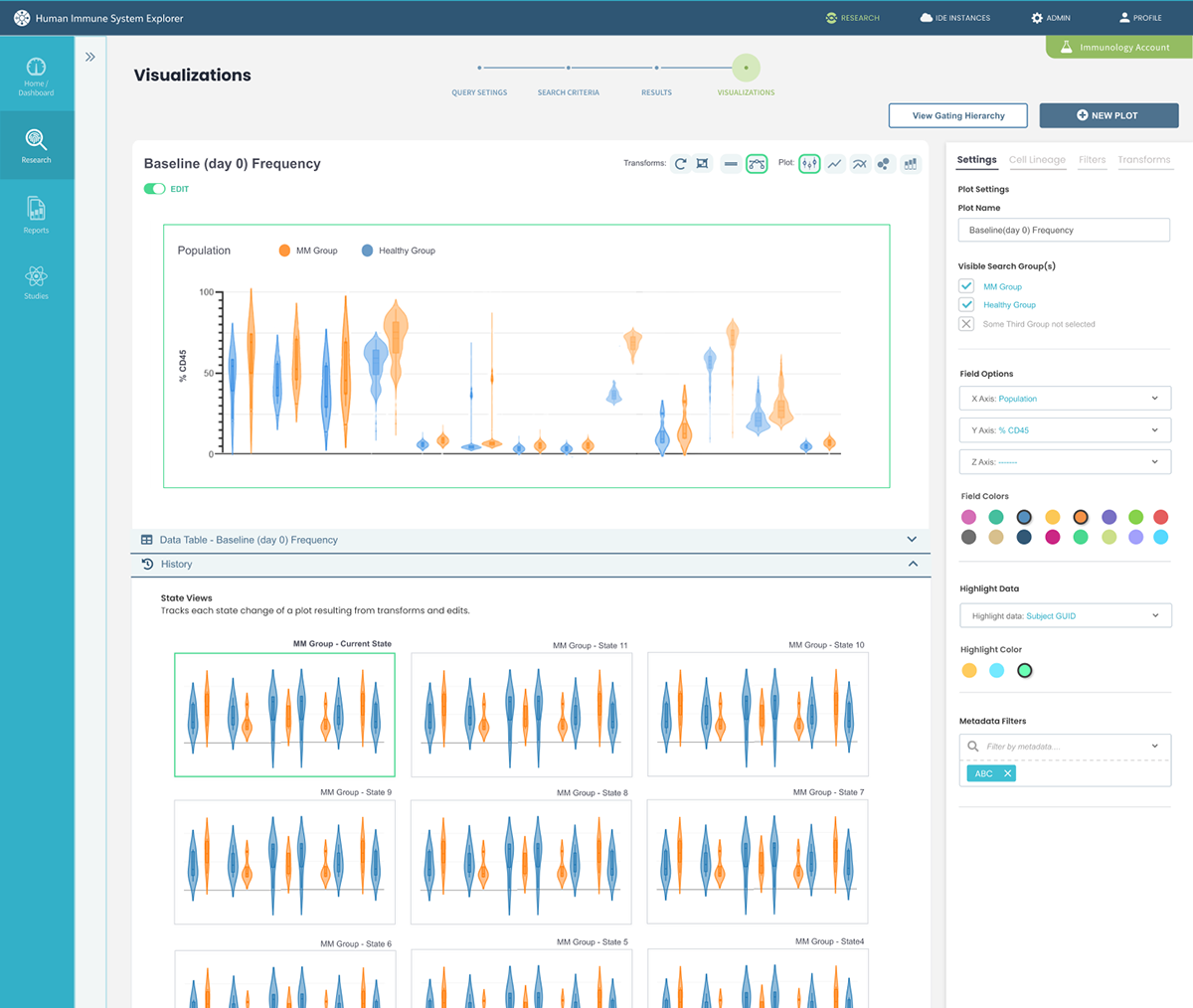
The key to meaningful immunology research goes far beyond targeting data. In fact, the bulk of their research is conducted through the interactive manipulation of visual plots. Part of the user understanding phase focused on identifying the types and combinations of plots that could best address research goals. Meaning that, rather than building plots from scratch we designed a system that immediately landed the user on a visualization page with pre-defined plots to provide instant value and a head-start on findings of potential interest.
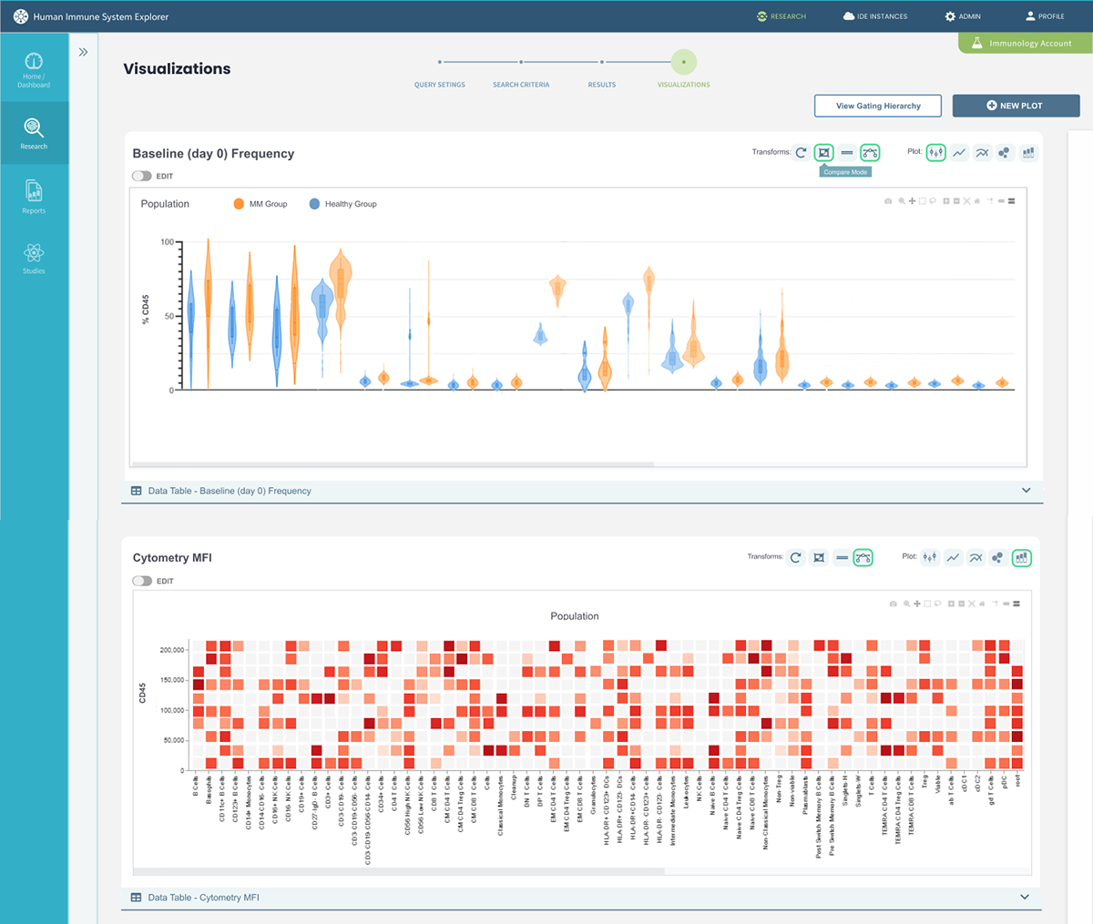
The design surfaces common plot transformations for quick access and an 'edit' toggle for more in-depth graph manipulation. In 'edit mode', researchers can see their edits applied instantly and track each transformation of the plot through an in-line 'history' panel.
Collaborative Workspaces
Immunology research is a very collaborative process. Both research and findings are subject to the input of multiple domain experts, especially when collaborating on a publishable study. To truly complete HISE the product needed a solid design and workflow for peer review, research contributions, and team communication.
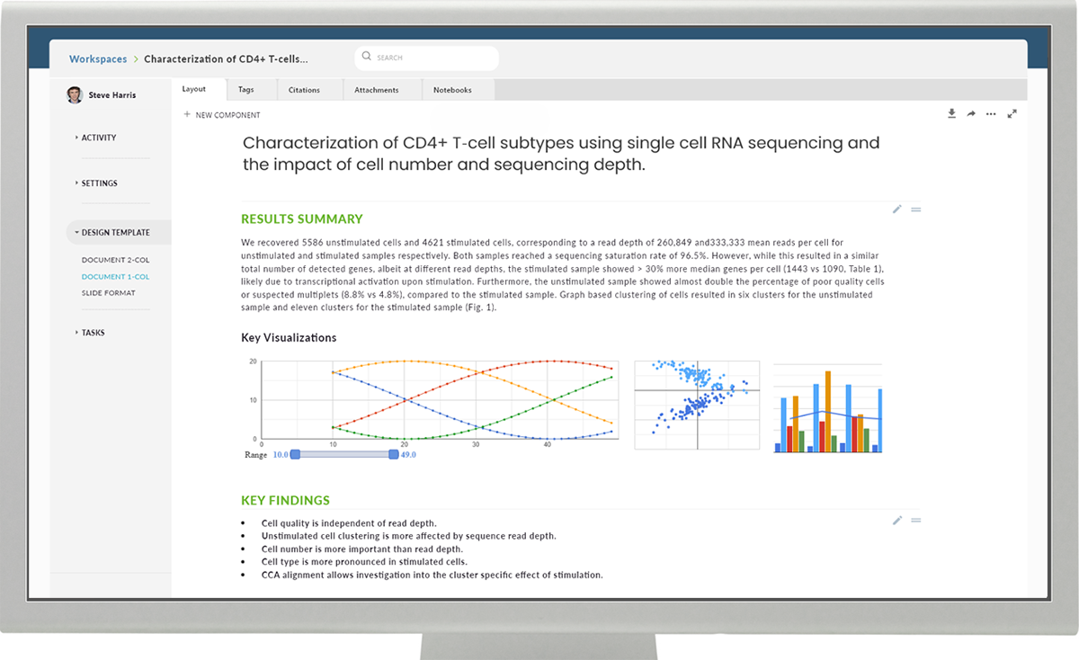
The concept of ‘Workspaces’ as seen below addressed these needs while also providing the tools and features necessary for publishing study findings to the greater scientific community.
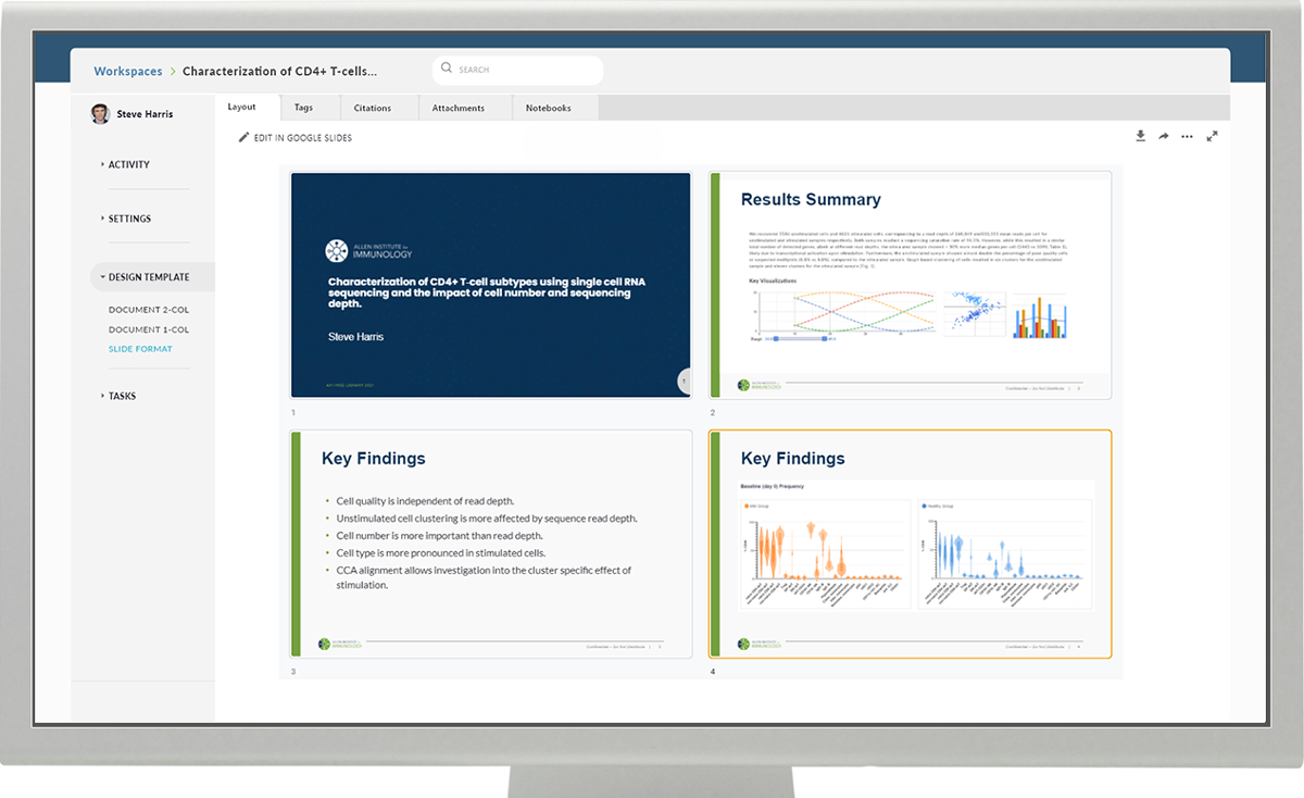
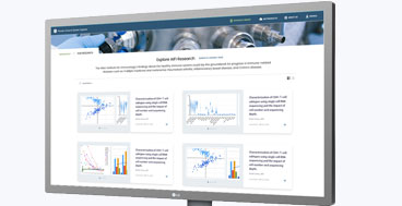
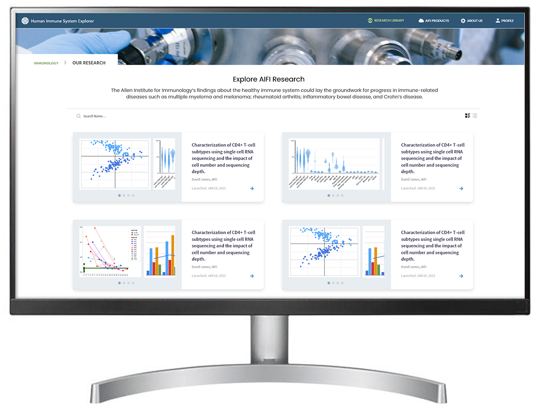
Published to a web-based community
The final design concept focused on one of the Institute's mandates: to employ a multi-disciplinary team approach in collaboration with academic centers of human immunology and to generate novel mechanistic insights into the immune synapse in health and in disease states.
The newly designed Human Immune System Explorer (HISE) is currently in development and slated to help fulfill the Allen Institute’s latest objective of simultaneously providing a foundational data set and tools for future immunological research as well as a novel collaboration portal for the broader scientific community.
Results and Impact
"We released the advanced search feature set last week and have demo’d it at our partner meeting this week – people love it and want more!" - Paul Meijer, Ph.D. Director, Software Development
Be sure to continue to the next project story about launching the PawsLikeMe pet matching site.